

REFLECTION
To evaluate the user experience, I conducted usability testing sessions with real users using the high-fidelity prototype. The goal was to observe user behavior, identify friction points in core user flows, and ensure the interface is intuitive and easy to navigate.
Reflection Section
This project taught me how crucial minimalist design and high speed are when designing for high-stress scenarios like Tatkal bookings.
Conducting usability testing with real users helped me realize that our design assumptions don't always match actual user behavior.
Personal Growth as a Designer
Overcoming Design Challenges
Future Improvements
Identifying core friction points and stripping away unnecessary clutter taught me the true power of a streamlined user flow.
If I had more time, I would explore edge cases further and test alternative layout options to see if checkout speed could be optimized even more.
All Projects
CHALLENGE
Cluttered UI: Legacy layout creates high cognitive load and confuses users.
Slow Tatkal Flow: Users lose critical seconds during peak hours due to slow checkout.
Intrusive Ads: Constant ads distract from the core travel booking flow.
External Redirects: Flights, buses, and hotels redirect to external sites instead of a unified experience.

Pain Points
RESEARCH
The Scale of Rail Travel: IRCTC is the primary digital gateway for millions of daily passengers in India, making efficiency and reliability critical.
Diverse User Base: Unlike niche apps, the audience ranges from tech-savvy daily office commuters to senior citizens booking tickets occasionally, requiring an exceptionally inclusive design.
Market & User Context
Connecting with
Users.
Secondary Research
User Survey
User Interviews
Competitive & Heuristic Audit
Identifying Core Pain Points
Cluttered Interfaces: Existing ticketing apps often overwhelm users with secondary utility banners (hotels, buses, food delivery) right on the
primary booking path.
Information Density: High text density and small touch targets create friction, especially under low-network conditions or during peak booking windows.
High Cognitive Load: Too many promotional elements and intrusive ads distract users from completing essential tasks quickly.
Tatkal Bottlenecks: Critical second-loss during high-demand booking windows due to complex navigation flows and unexpected redirection.
Fragmented Experience: Lack of a streamlined, distraction-free environment for users who need quick ticket confirmation.
Through primary and secondary research, we gathered key insights on passenger preferences and booking friction points. Through this data, we were able to establish foundational understandings of our target audience's core challenges.


Analyzed Play Store and App Store reviews to identify common user complaints regarding clutter and booking failures.
Gathered quantitative data from travelers to understand primary pain points during peak hours.
Conducted discussions with frequent commuters to uncover navigation and friction bottlenecks.
Key Findings from Research
INSIGHTS
User Personas
I created two personas to get a better understanding of the types of users, their goals, and frustrations. Personas were created from the types of users that I interviewed (people of different ages).
Priyanka Jha is a 24-year-old student who needs a fast, shortcut-driven booking process during peak rush hours, because she wants to book
tickets for multiple people quickly without wasting her study time or missing out on seats.
Problem Statement (Priyanka):
Sanjay Shah is a 65-year-old retired engineer with knee joint pain who needs an easy, direct way to select and secure lower berth preferences during booking, because he cannot climb train stairs and needs a comfortable long-distance journey with his wife.
Problem Statement (Sanjay):
If the app gives prominent, guaranteed options for lower berth preferences during the booking flow, then Sanjay will travel comfortably without worrying about his physical limitations.
Hypothesis Statement (Sanjay):
If Priyanka can book tickets using a dynamic recent-search card during Tatkal hours, then she will complete her bookings 2 times faster and
won't face booking failures.
Hypothesis Statement (Priyanka):
Problem & Hypothesis Statements

GOALS
Description: Streamline the end-to-end ticket booking journey so that users can complete bookings in under 60 seconds without cognitive overload or unnecessary steps.
Why it matters: Current users (such as daily commuters) face a long and confusing flow that causes unnecessary delays.
Minimize Booking Friction & Time
Eliminate Distractions & Intrusive Ads
Streamline High-Traffic Tatkal Bookings
Description: Remove all intrusive pop-up advertisements and repetitive elements from core transactional flows (such as search, passenger selection, and payment).
Why it matters: Survey insights show that mid-flow advertisements and repetitive elements are primary contributors to user frustration and critical booking delays.
Description: Provide a dedicated fast-checkout feature (such as a 1-Click Tatkal mode) that pre-fills journey details and minimizes payment failures during peak hours.
Why it matters: Last-minute and urgent travelers need to secure confirmed tickets during the 10 AM and 11 AM rush windows without experiencing system drop-offs.
Goal statements define how the platform will address users needs and how we will measure the impact of these solutions.
Design Objectives

PROCESS
Research & Analysis: Conducting user surveys, analyzing competitors, and identifying key pain points in the existing app flow.
Define & Strategy: Creating target user personas and defining clear goal statements and design objectives.
Ideation & Architecture: Prioritizing features (Must-have/Should-have) and planning the new Information Architecture (IA).
Wireframing & Design: Sketching low-fidelity wireframes and designing high-fidelity UI screens.
Prototyping & Testing: Building an interactive prototype to test the fast-booking flow and measure impact.
By using the Design Thinking methodology, I focused on understanding the needs of users and applied what I learned throughout the process to the project.

ARCHITECTURE
Information Architecture (IA) organizes content so users can easily navigate and find what they need. A site map visualizes this structure, showing how pages and features are connected.

USER FLOW
A user flow visualizes the journey a user takes within the project. It outlines each step from the entry point to the final interaction, helping to understand how users navigate and complete their goals seamlessly.

WIREFRAME
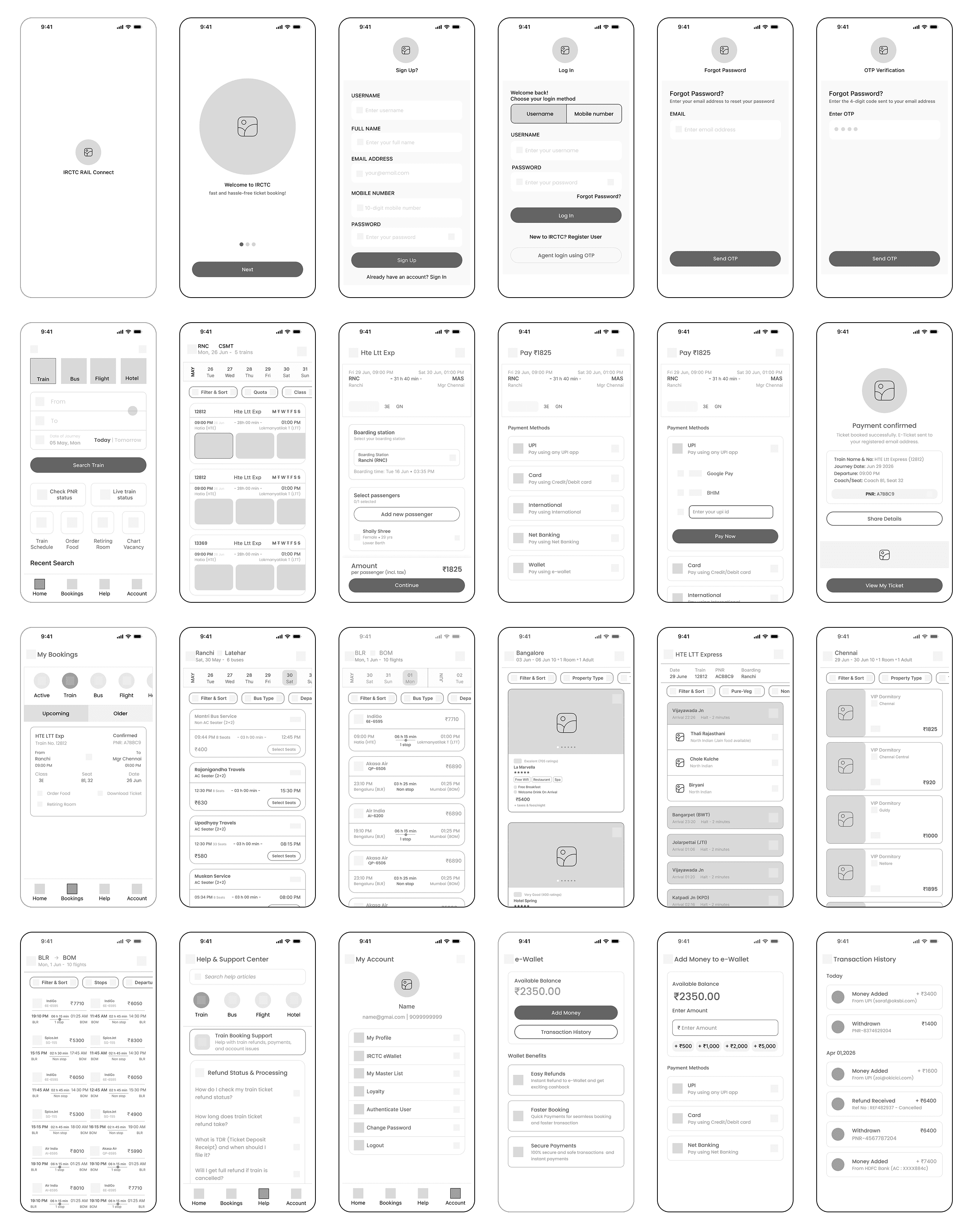
Mid Fidelity Wireframe highlights structure and interactions, helping refine usability before moving to final designs.
INTERFACE
High fidelity mockup shows the final look of the app with real colors, clear fonts, and actual images. Every screen is designed using standard iOS guidelines to make sure the app looks beautiful, modern, and easy for everyone to use.

IRCTC
Reimagining the IRCTC
Mobile App
Overview
The IRCTC app is one of India's most popular travel booking platforms. This redesign reimagines the mobile experience with a cleaner interface, simplified navigation, and an improved booking flow.
To make train, bus, flight, and hotel bookings faster, easier, and more intuitive while reducing cognitive load and streamlining complex booking flows.
My role within this project was the user interface designer for IRCTC's screens and prototype, in addition to the revamped design system.
ROLES
UI/UX Designer
Wireframing
Prototyping
TIMELINE
10 Weeks
TOOLS
Figma
Miro
Gemini


Overview
The IRCTC app is one of India’s most popular travel booking platforms. This redesign simplifies the booking experience with a cleaner interface, clearer navigation, and a more intuitive flow.
ROLES
UI Designer
Wireframing
Prototyping
TIMELINE
10 Weeks
TOOLS
Figma
Miro
Gemini
Reimagining
the
IRCTC
Mobile App
Challenge
Cluttered UI: Legacy layout creates high cognitive load and confuses users.
Slow Tatkal Flow: Users lose critical seconds during peak hours due to slow checkout.
Intrusive Ads: Constant ads distract from the core travel booking flow.
External Redirects: Flights, buses, and hotels redirect to external sites instead of a unified experience.
Process
Research & Analysis: Conducting user surveys, analyzing competitors, and identifying key pain points in the existing app flow.
Define & Strategy: Creating target user personas and defining clear goal statements and design objectives.
Ideation & Architecture: Prioritizing features (Must-have/Should-have) and planning the new Information Architecture (IA).
Wireframing & Design: Sketching low-fidelity wireframes and designing high-fidelity UI screens.
Prototyping & Testing: Building an interactive prototype to test the fast-booking flow and measure impact.
By using the Design Thinking methodology, I focused on understanding the needs of users and applied what I learned throughout the process to the project.
Research
Through primary and secondary research, we gathered key insights on passenger preferences and booking friction points. Through this data, we were able to establish foundational understandings of our target audience's core challenges.
1. Diverse User Base & High Scale
IRCTC ka daily active audience bohot bada hai—daily office commuters se lekar senior citizens tak—isliye layout sabhi ke liye accessible aur easy-to-use hona zaroori hai.
2. Cluttered UI & High Cognitive Load
Promotional banners, ads, aur high text density primary booking flow ko confuse karti hain aur unnecessary friction add karti hain.
3. Critical Booking Bottlenecks (Tatkal)
Complex navigation aur sudden redirections ki wajah se high-demand windows (jaise Tatkal booking) mein seconds ka loss hota hai, jo booking flow ko break kar deta hai.

Secondary Research
User Survey
User Interviews
Key Findings from Research
Insights
I created two personas to get a better understanding of the types of users, their goals, and frustrations. Personas were created from the types of users that I interviewed (people of different ages).

Problem & Hypothesis Statements
Problem Statement (Priyanka):
Priyanka Jha is a 24-year-old student who needs a fast, shortcut-driven booking process during peak rush hours, because she wants to book
tickets for multiple people quickly without wasting her study time or missing out on seats.
Hypothesis Statement (Priyanka):
If Priyanka can book tickets using a dynamic recent-search card during Tatkal hours, then she will complete her bookings 2 times faster and
won't face booking failures.
Problem Statement (Sanjay):
Sanjay Shah is a 65-year-old retired engineer with knee joint pain who needs an easy, direct way to select and secure lower berth preferences during booking, because he cannot climb train stairs and needs a comfortable long-distance journey with his wife.
Hypothesis Statement (Sanjay):
If the app gives prominent, guaranteed options for lower berth preferences during the booking flow, then Sanjay will travel comfortably without worrying about his physical limitations.
Goals
Goal statements define how the platform will address users needs and how we will measure the impact of these solutions.
Design Objectives
Minimize Booking Friction & Time
Description: Streamline the end-to-end ticket booking journey so that users can complete bookings in under 60 seconds without cognitive overload or unnecessary steps.
Why it matters: Current users (such as daily commuters) face a long and confusing flow that causes unnecessary delays.
Eliminate Distractions & Intrusive Ads
Description: Remove all intrusive pop-up advertisements and repetitive elements from core transactional flows (such as search, passenger selection, and payment).
Why it matters: Survey insights show that mid-flow advertisements and repetitive elements are primary contributors to user frustration and critical booking delays.
Streamline High-Traffic Tatkal Bookings
Description: Provide a dedicated fast-checkout feature (such as a 1-Click Tatkal mode) that pre-fills journey details and minimizes payment failures during peak hours.
Why it matters: Last-minute and urgent travelers need to secure confirmed tickets during the 10 AM and 11 AM rush windows without experiencing system drop-offs.
Architecture
Information Architecture (IA) organizes content so users can easily navigate and find what they need. A site map visualizes this structure, showing how pages and features are connected.
User Flow
A user flow visualizes the journey a user takes within the project. It outlines each step from the entry point to the final interaction, helping to understand how users navigate and complete their goals seamlessly.
Wireframes
Mid-fidelity wireframes clarified layout, interactions, and hierarchy before high-fidelity interface design began.
Interface
High fidelity mockup shows the final look of the app with real colors, clear fonts, and actual images. Every screen is designed using standard iOS guidelines to make sure the app looks beautiful, modern, and easy for everyone to use.
Reflection
To evaluate the user experience, I conducted usability testing sessions with real users using the high-fidelity prototype. The goal was to observe user behavior, identify friction points in core user flows, and ensure the interface is intuitive and easy to navigate.
Personal Growth as a Designer
This project taught me how crucial minimalist design and high speed are when designing for high-stress scenarios like Tatkal bookings.
pain points in the existing app flow.
Overcoming Design Challenges
Identifying core friction points and stripping away unnecessary clutter taught me the true power of a streamlined user flow.
Reflection Section
Future Improvements
If I had more time, I would explore edge cases further and test alternative layout options to see if checkout speed could be optimized even more.
All Projects